
Red Swallow Creative
Design | Art | Photography
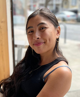
by Sandy Lee
About the Creator
Welcome to Red Swallow Creative!
Hello! Sandy here, the creator behind Red Swallow Creative. A bit about myself—I am ethnically Chinese, but born and raised in East Side San Jose, CA by my immigrant family.
I chose to name my brand and creative outlet Red Swallow Creative because I hope to connect my background with what I am doing as a creative. "Red Swallow" is a mistranslation of my given Chinese name, 宏燕 (Hóng Yàn), in which the correct English translation is “magnificent swallow or songbird.” In Chinese, the pinyin Hóng is a homonym for the color red. I believed for many years that my name had a meaning close to a “red bird” since I was not formally taught to read or write in Chinese, and I wanted to highlight that cultural struggle into my branding. The name was given to me by my late fraternal grandmother, who was an instructor teaching Chinese back when she lived in Vietnam before her family immigrated to California, US. Red Swallow reminds me of my curiosity and desire to connect with my cultural heritage and of how it influences my creativity and personal life.
I draw inspiration a lot from my cultural background, my life experiences, the various approaches of creating, as well as from the natural world into my creations. In 2023, I had changed my logo from an actual swallow bird silhouette to my current swallowtail butterfly illustration as it felt more suited for my creative identity. I find butterflies in general to have a fleeting yet mesmerizing presence and also like that they represent transformation, in which I was taking a nerve-wracking step to elevate my brand and slowly gathering the courage to go out of my comfort zone to start putting myself out there to reach a broader audience such as vending at in-person events. Additionally, the swallowtail butterfly can also symbolize joy and endurance, which heavily resonates with me. With the 2023 logo I had illustrated and redefined my design system, it now embodies elements that I believe are "me". If you don't mind my tangent, I had actually designed this logo as a tattoo for myself and was originally in a Chinaware blue color. I have yet to commit to the pain to get that tattoo, but I had an epiphany at the time that it can work as my logo as well. Let me explain the design elements from the design—1) the color red symbolizes passion, love, and luck (in Chinese culture); 2) my depiction of Chinaware and kintsugi (the Japanese technique of repairing cracks or broken ceramics with gold) represent the duality of fragility and resilience; 3) illustrations of ginko leaves, bougainvillea, and plum blossoms that have meaning to me; and 4) the butterfly having skeletal bones showing despite having exoskeletons is to signify vulnerability and the concept of momento mori. All of these elements were choices I made that I felt represent who I am, and that's how it came to be my brand logo.
My main career is as a Graphic Designer, but I have a passion for a wide range of creative media so I created Red Swallow Creative as my creative outlet outside of corporate work. I've found that through my various creative experiences, I tend to do a lot of mixed media. A majority of my art/inventory include resin, metal, and photography outside of design. Currently, you can find some of my products online at SJ Made or at their Japantown San Jose location. Since the beginning of 2025, I have started to vend at some local crafts fairs and events, so stay tuned with any news or updates on the Red Swallow Creative Instagram!
If you're here to inquire about my Graphic Design career and my creative portfolios, please use the Contact section to provide your reason for contacting and to request the password to access the locked Portfolios section.